Pages

Monday, October 17, 2011

The Superstroke Art Movement's Manifesto


The Manifesto of The Superstroke Art Movement.

The Superstroke Art Movement was formed as a reaction to the influence that The Superflat Art Movement has on contemporary art. Superstroke still regards Superflat as the most avant-garde and most important 21st century art movement in the world at the moment. According to ourselves The Superstroke Art Movement is the second most avant-garde (after Superflat), most expressive 21st century art movement in the world at the moment. Therefore it is important to understand Superflat when confronted with an art work from The Superstroke Art Movement.


According to Wikipedia, Superflat can be described as follows: Superflat is a postmodern art movement, founded by the artist Takashi Murakami, which is influenced by manga and anime. It is also the name of a 2001 art exhibition, curated by Murakami, that toured West Hollywood, Minneapolis and Seattle.

"Superflat" is used by Murakami to refer to various flattened forms in Japanese graphic art, animation, pop culture and fine arts, as well as the "shallow emptiness of Japanese consumer culture." A self-proclaimed art movement, it was a successful piece of niche marketing, a branded art phenomenon designed for Western audiences. Superflat has been embraced by American artist creating a hybrid called “SoFlo Superflat”.
Artists whose work is regarded as “Superflat” include Chiho Aoshima, Mahomi Kunikata, Sayuri Michima, Yoshitomo Nara, Tatsuyuki Tanaka, Aya Takano and Takashi Murakami. In addition, some animators within anime and some manga artist are considered Superflat, especially Koji Morimoto, and the work of Hitoshi Tomizawa, author of Alien 9 and Milk Closet.
Murakami defines Superflat in broad terms, so the subject matter is very diverse. Often the works explore the consumerism and sexual fetishism that is prevalent in post-war Japanese culture. This often includes lolicon art, which is parodied by works such as those by Henmaru Machino. These works are an exploration of otaku sexuality through grotesque and/or distorted images. Other works are more concerned with a fear of growing up. For example, Yoshitomo Nara’s work often features playful graffiti on old Japanese ukiyo-e executed in a childish manner. And some works focus on the structure and underlying desires that comprise otaku and overall post-war Japanese culture.
Murakami is influenced by directors such as Hideaki Anno.


One of the artists from The Superflat Art Movement that has quite a large influence on The Superstroke Art Movement is Yoshitomo Nara. The art of Yoshitomo Nara can be described as follows: Nara first came to the fore of the art world during Japan’s Pop art movement in the 1990s. The subject matter of his sculptures and paintings is deceptively simple: most works depict one seemingly innocuous subject (often pastel-hued children and animals drawn with confident, cartoonish lines) with little or no background. But these children, who appear at first to be cute and even vulnerable, sometimes brandish weapons like knives and saws.


Their wide eyes often hold accusatory looks that could be sleepy-eyed irritation at being awoken from a nap—or that could be undiluted expressions of hate.
Nara, however, does not see his weapon-wielding subjects as aggressors. "Look at them, they [the weapons] are so small, like toys. Do you think they could fight with those?" he says. "I don’t think so. Rather, I kind of see the children among other, bigger, bad people all around them, who are holding bigger knives…"
Lauded by art critics , Nara’s bizarrely intriguing works have gained him a cult following around the world and the respect from other artists from The Superflat Art Movement.


The Super Flat Art Movement Manifesto written by Takashi Murakami is as follows:

The world of the future might be like Japan is today -- super flat.

Society, customs, art, culture: all are extremely two-dimensional. It is particularily apparent in the arts that this sensibility has been flowing steadily beneath the surface of Japanese history. Today, the sensibility is most present in Japanese games and anime, which have become powerful parts of world culture. One way to imagine super flatness is to think of the moment when, in creating a desktop graphic for your computer, you merge a number of distinct layers into one. Though it is not a terribly clear example, the feeling I get is a sense of reality that is very nearly a physical sensation. The reason that I have lined up both the high and the low of Japanese art in this book is to convey this feeling. I would like you, the reader, to experience the moment when the layers of Japanese culture, such as pop, erotic pop, otaku, and H.I.S.ism, fuse into one. [H.I.S. is a discount ticket agency in Japan. By lowering the price of travel abroad, the company is having a profound effect on the relationship between Japan and the West.]


The manifesto written for The Superstroke Art Movement by Conrad Bo in 2008 is as follows:

1. Paintings and sculptures should be executed using expressive even violent brushstrokes on at least some part of the picture or surface.
2. Should a photograph be used for a figurative painting, the objection should not be Photorealism, but Expressionism.
3. If mediums such as pen, pencil, etc are used, the pen and pencil strokes must at least be overly expressive for it to be considered a Superstroke picture.
4. Paintings can be executed in both the abstract and figurative.
5. Subject matters such as Africa, light, dark, life and death are encouraged.
6. Collage, Stencil and Calligraphy may be used for impact.
7. The concept, Art for the sake of art, does not apply in Superstroke. In Superstroke it is art for the sake of Superstroke, as the artist must always strive for paintings rich in texture, or excessive brush or pencil strokes.

Here are some photos from The Superstroke Art Movement.


Friday, May 6, 2011

The Superblur Art Movement


The Superblur concept in art only became a movement in my eyes when Brink De Villiers and Lisa Basson joined me in promoting the concept of Superblur. The manifesto for The Superblur Art Movement has changed somewhat, and is a follows:

1) Art produced in Superblur should blur the lines between what is painting, photography, abstract , realism etc.

2)Violently shaking the camera when taking a picture for a photograph that resembles abstract art.

In 2010 we have in a way agreed that the 2 points in the manifesto for The Superblur Art Movement is enough to explain to the viewer what we are trying to achieve and also helping us achieve an artistic commonality.

Supersblur is a kind of of shoot art movement from The Superstroke Art Movement.

The above are some examples of art produced by The Superblur Art Movement.

Wednesday, September 8, 2010

Wednesday, August 18, 2010

The influence of Christopher Wool on The Superstroke Art Movement's art.

Both Christopher Wool and Richard Prince continues to influence The Superstroke Art Movement's art, and especially that of Conrad Bo, May Wentworth and Liezel Botes.

The Manifesto for Superstroke written by Conrad Bo is as follows:

1. Paintings should be executed using expressive even violent brushstrokes on at least some part of the picture.

2. Should a photograph be used for a figurative painting, the objection should not be Photorealism, but Expressionism.

3. If mediums such as pen, pencil, etc are used, the pen and pencil strokes must at least be overly expressive for it to be considered a Superstroke picture.

4. Paintings can be executed in both the abstract and figurative.

5. Subject matters such asAfrica, light, dark, life and death are encouraged.

6. Collage, Stencil and Calligraphy may be used for impact.

7. The Super Expressive Brush, Pen etc. strokes can be used on any object with a surface, and this makes sculpture possible in Superstroke.

8. The concept, Art for the sake of art, does not apply in Superstroke. In Superstroke it is art for the sake of Superstroke, as the artist must always strive for paintings rich in texture, or excessive brush or pencil strokes.

Here is an example of a painting called Fool.


Here is a description of the art of Christoper Wool by the auction house Christies:

Christopher Wool's brash, explicit paintings were developed against the backdrop of inner city blight and urban deprivation that affected most large cities in the late 1980s and early 1990s.Blue Fool, a consummate example of Wool's most celebrated word paintings, is intrinsically linked to the post Punk scene of New York, its energy and attitude running through the very heart of the work.


Its outsized capital letters leap out off the wall, seemingly barking insults at a volume loud enough to be heard over the noise of the city. Yet while the aesthetics are clear and explicit, the work's meaning remains more ambiguous. The participants in this dialogue remain anonymous with the short and perfunctory exchange becoming part of the millions of similar exchanges that take place everyday. In both its visual and subconscious meaning,
Blue Fool is very much a product of New York in the Punk years.

The four large blue letters that spell out the word 'FOOL' are tightly constrained by the edges of a large, flat white aluminum support. Wool's use of gigantic lettering and his refusal to allow these letters space to breath creates an intimidating atmosphere. The letters dominate the room and being constrained by the tight edges of the work gives them a sense of being pushed out of the picture plane. This sense of foreboding is heightened by the typeface. Similar to the
Stencilfont adopted by the U.S. military after the World War II, Wool's typeface matches it in its utilitarian nature and these elements combined with its physical size creates a sense of stark authority.

Wool's emergence as a painter in the early 1980s coincides with a period of soul searching within the art world about the state of painting. In his 1981 essay "The Death of Painting" the influential critic Douglas Crimp condemned the belief in painting and the investment in the human touch that was perceived to be crucial to maintaining painting's unique aura. It was into this environment that Wool began his exploration of the painterly process and the different techniques that could be used to expand its properties. Wool began using words as imagery as early as 1987 after seeing a brand new white truck with the words 'SEX LUV' hand-painted across it. This first collection of word paintings was created during an intensely creative period for the artist and focused on words or phrases with multiple meanings. The effect was often only achieved when Wool broke them up in the composition of the painting. His 'AMOK' becomes 'AM OK' when enlarged to fit the scale of his canvas.
Blue Fool, with the large letters that spell out 'FOOL', corresponds to the letters of the artist's name and simultaneously pokes fun at the viewer and at the same time creating a humorous self-portrait.

Wool's work is drawn from a variety of sources both inside and outside the art world. Like many artists of his generation he was concerned with the intrinsic nature of painting and was particularly interested in the process of applying paint on a surface. He was attracted the works of Richard Serra, and his sculptures of splashed lead in particular. These ideas became central to his ideas of process and the covering of surfaces in relation to painting, and to picture making in particular.

"Wool's work shares Pop Art's affection for the vulgar and the vernacular, and in form it recalls Pop's graphic economy of means, iconic images and depersonalized mechanical registration" (M. Grynsztejn, "Unfinished Business" in A. Goldstein,
Christopher Wool, Los Angeles, 1999, p. 266). The no-frills lettering recalls Minimalism, especially the word works of Joseph Kosuth. However, where Kosuth's works are deliberately self-constrained, hermetically sealed by the words that they formed, Wool's Blue Fool is rogue; it is disjointed and points to the ambiguity of language. In this respect, Wool's word paintings have been seen as an attempt to illustrate the limitations and convulsive nature of language. By breaking up the words into their constituent parts and making the viewer reinterpret the meanings of those words used in his paintings, he highlights the underlying failure of language as an effective and objective way of communication.

Richard Prince photograph and influence of The Superstroke Art Movement.


Richard Prince has had quite an influence in the thinking of how we take the Superstroke Art Movement forward. He is the master of appropriation, just like Gerhard Richter. A super expressive brush stroke can be utilized on anything with a surface and that makes sculpture and prints possible in the Superstroke Art Movement.


Here is how Christies describs this photograph of Richard Prince.
The cowboy is one of the most enduring modern mythic figures, invoking ideas of the life outdoors, of hard work and a hard life, of pioneering, of understanding nature, of oneness with the land, of fighting a noble fight, of creating so much of the United States. The notion of the Plains cattle herder intermingles, through the jumbled perspective of John Wayne, Sergio Leone, Roy Rogers and Rawhide, with the gunfighter. The hardships of the good, the bad and the ugly combine to create a mythical landscape, still infinitely evocative to this day. And so the cowboy was the perfect subject for the arch-appropriator of images, Richard Prince, as shown in Untitled (Cowboy Saddling Horse), executed in 1980-83.

This is not an ordinary cowboy. This is a Marlboro cowboy from the flurry of ads from one of the most successful campaigns in the world. Despite being removed from international circulation for many years, images of the Marlboro cowboy are still evocative, and instantly recognizable, as in
Untitled (Cowboy Saddling Horse). Here, Prince cropped the original image, removing any caption, and rephotographed it, creating his own work. In this deceptively simple act of appropriation, Prince waves a strange semantic wand over the picture. The cowboy of the ads, who was intended only to invoke the world of rugged individualism and manliness that would hopefully encourage people to buy Marlboro cigarettes, has once again attained a role in an implied Western narrative. Without the labels and logos, this image appears to be a brief insight into a larger, overarching tale, or perhaps a still from a movie. The cowboy has become a character again, not just a visual means to peddle a product. The picture straddles the world of advertising -- of ruthless consumerism and the exploitation of demographics and markets -- and the world of the Alamo, Remington's paintings and Eastwood's movies, leaving both image and viewer in highly ambiguous states.

All this creates a tension between the romantic image of one man and his horse, and the sad reality of law suits, scientific research and controversy. And yet, in a world in which cigarette advertising has been increasingly controlled and even banned, Prince wryly exploits that sense of the cowboy as a romantic, knows-no-bounds figure striving to exist in a world that increasingly does not need him. In terms of advertising at the 20th Century's end and agriculture at its beginning, the cowboy stalks a domain that has a limited lease on life. He is an inherently tragic, romantic symbol of old ways and old worlds, of the creep of technology. He is a victim of change, incorporating his own obsolescence, both in advertising and in the increasingly tamed Wild West. Society has moved on, depriving the cowboy -- and the Marlboro Man -- of his territory.

Prince's role as artist and appropriator is itself reflected in the figure of the cowboy, the renegade. In
Untitled (Cowboy Saddling Horse), and indeed in all the works that Prince created that relied on the reuse of someone else's image, he was deliberately trespassing, straying with only the faintest claim to legality into the territories of the cigarette giants and the ad companies. He was not borrowing their images, but was effectively stealing them and putting them to his own use. In this sense, the self-reliant cowboy who features in these pictures comes to represent Prince himself, waging his own unconventional, one-man campaign, breaking down the boundaries of the world of images and ownership, railing against the limitations of copyright; turning, in short, from regulator to bandido.

Saturday, July 31, 2010

Superstroke. Secret influences on The Superstroke Art Movement


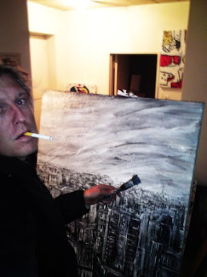
The Superstroke Art Movement has many secrets that we reveal only now and then. Here is some photographs that shows some of the process that takes place when art in The Superstroke Art Movement is produced.


Superstroke. The obsession with the plus.


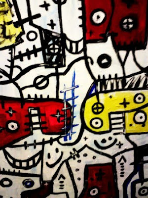
Paintings produced by the Superstroke Art Movement and especially by myself and Mr. Propaganda always usually consists out of a lot of pluses and mathematical signs.